Newsletters are getting personal
A lot of my advice, especially to small businesses, involves getting more personal in their email newsletters. It remains a struggle to convince some businesses to include real names (not just the brand name), be a little less perfectionist in their designs, and write like a real human.
The more human you can be in your email newsletter, the easier it is for the reader to form a connection, establish trust, and build a long-term relationship with your business.
However, since every audience is different, there’s never a one-size-fits-all approach or template for a human-first newsletter. I love collecting examples of how successful small businesses are adapting to this.
Take Josh Spector, for example, who writes specifically for email marketers. Last year this is how his newsletter looked:
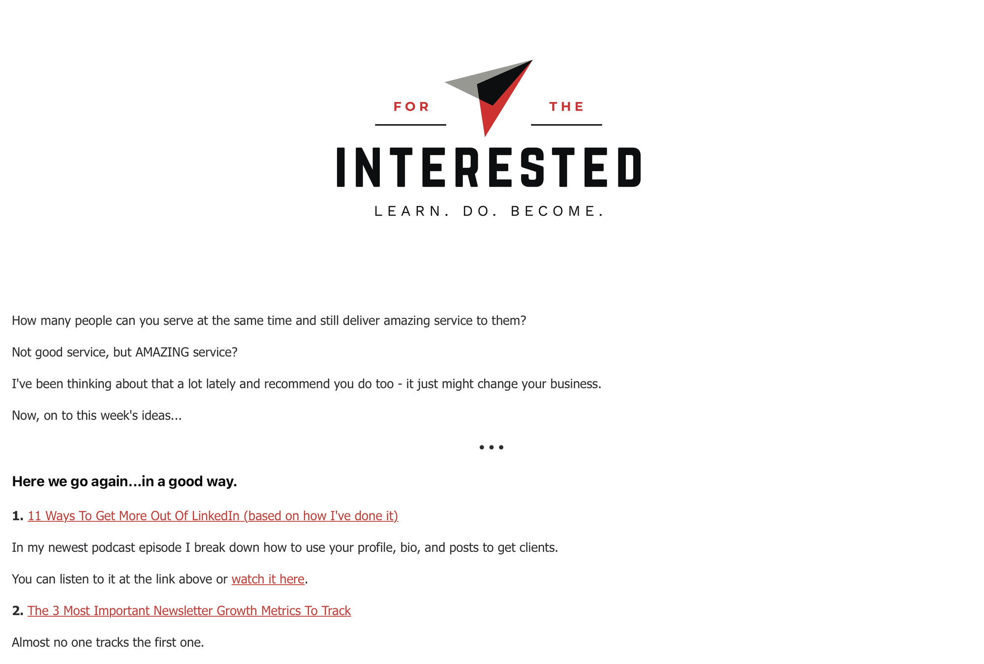
He recently redesigned his newsletter to highlight that it’s coming from a real person. This bucks the now-default, Substack-ificated trend of titling your newsletter with a brand name rather than your own name. I love it.
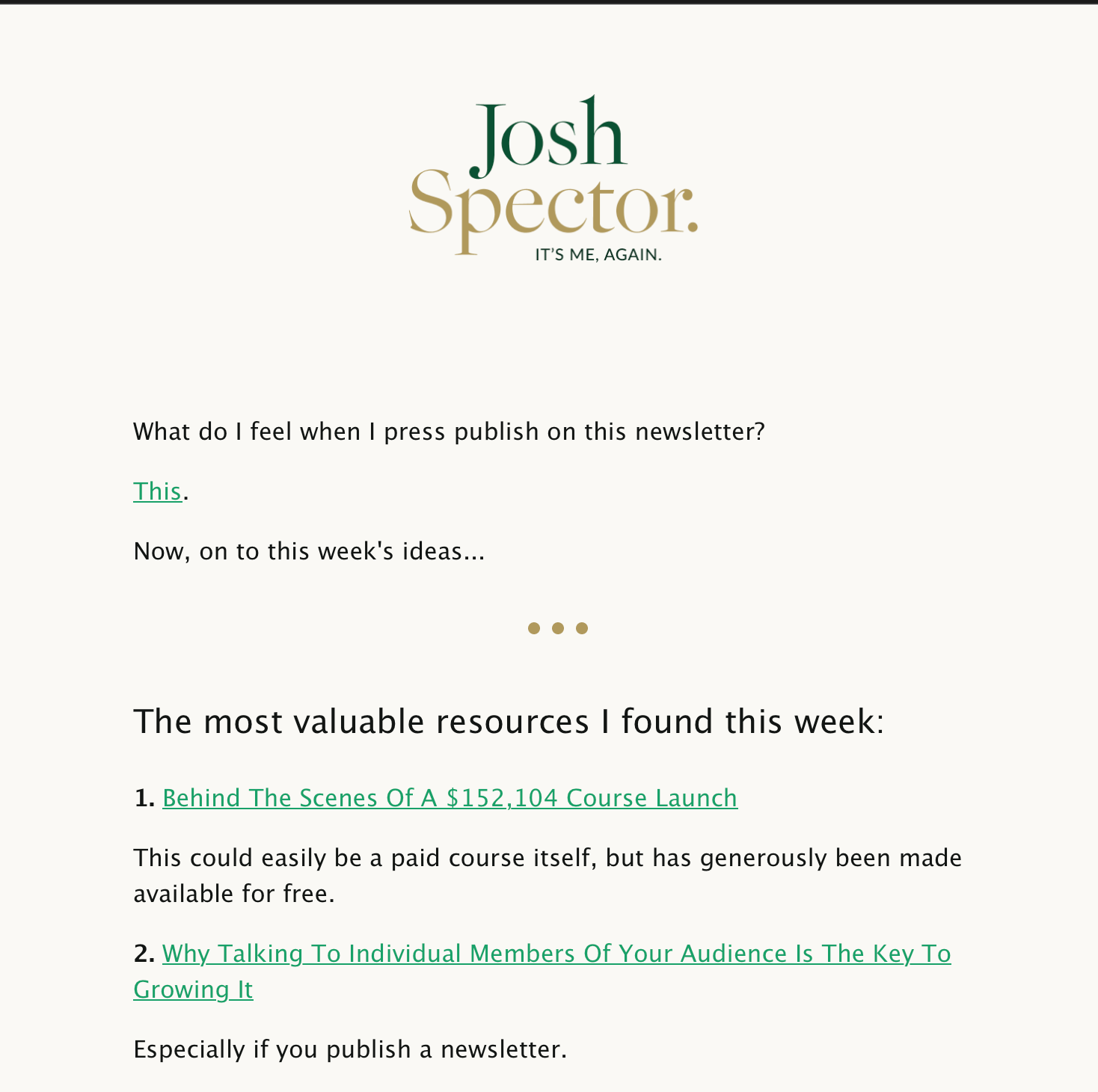
Besides the title change, it’s a very polished design. But I don’t think it’s over-polished for his audience. His audience knows newsletter design and probably appreciates the improved reading experience. I know I do.
But what about broader audiences?
One of the first examples I give for the best minimal, plain-text approach to humanizing an email is from Derek Sivers. Derek was a founder who sold his company to Jeff Bezos, became an author, and moved to New Zealand. He doesn’t need your attention, approval, or money. He does this for fun. His emails reflect the simplest, clearest possible way to convey a message.
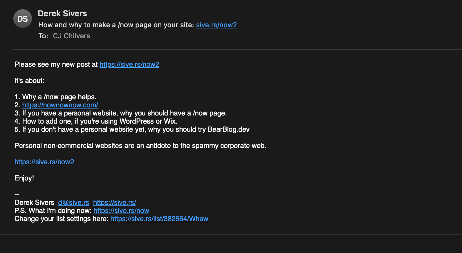
What a throw-back! I was sending emails like this back in the 90s. Plain text converted better back then, and it probably converts better now – as long as you have the audience for it. There’s nothing that screams, “I’m an actual human and you can reply to this,” better than a plain text email.
Some marketers are splitting the difference. I just received this email from the Vice President of Blackwing, a very fancy pencil brand I love. They usually send me over-designed emails, fitting to their brand, but I was happy to see they’re also experimenting with a more personal approach.
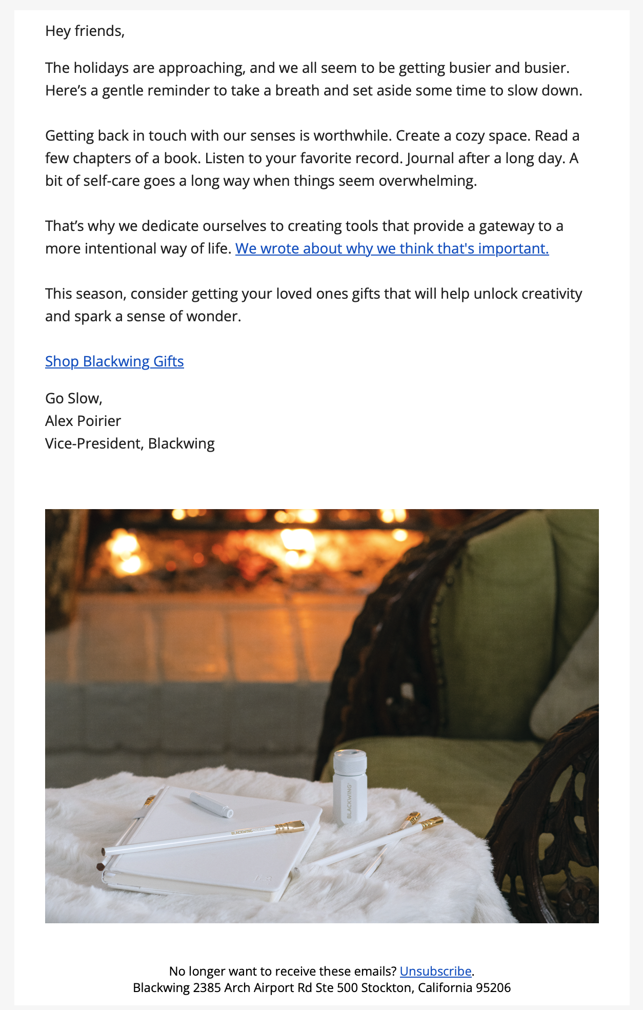
I would have gone even simpler on the body copy, but I suspect this email pulled in great numbers for them, compared to their more traditional emails.
The Do Lectures newsletter is part of a family of newsletters known for experimenting with styles ranging from the photo-filled and perfectly polished Chicken Shed Chronicles to emails like this, featuring hand-drawn images from CEO David Hieatt.
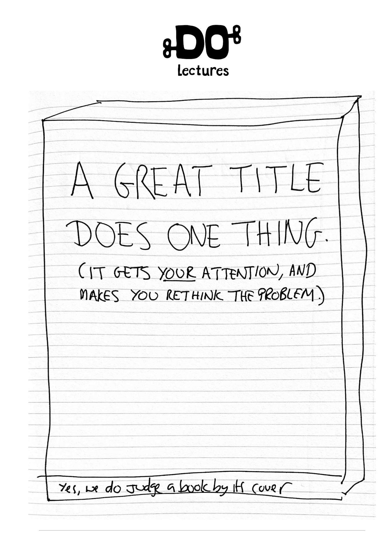
(cut for length)
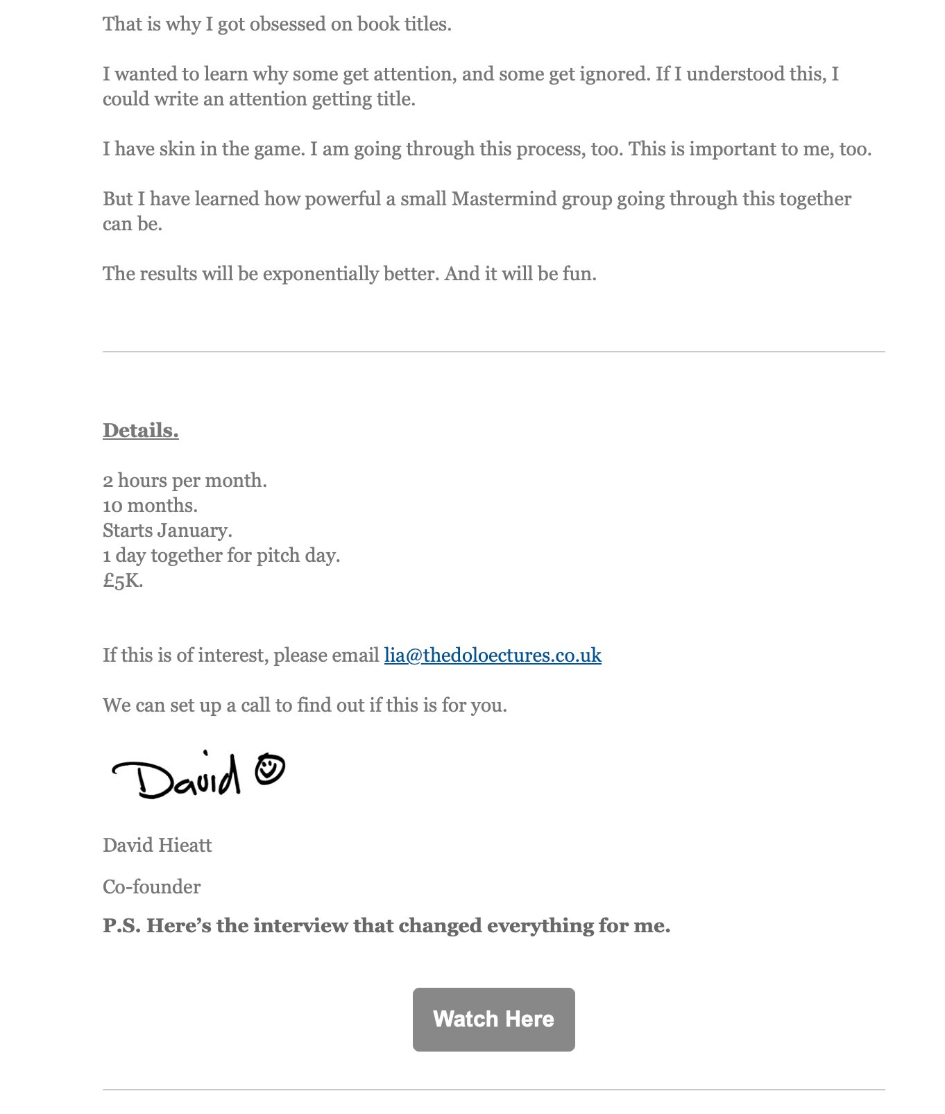
How cool is that signature? So many “humanized” emails go for the flowy, cursive signature, but this feels more realistic — like you’re actually getting a note from David.
But, for all of these newsletters, I’m not sure a signature does much. It seems like a cheat code for personalization.
I admit, it looks cool. I want one.
It also feels like a weird holdover from physical letters that seems redundant in an email. But I don’t have any data to back up whether readers feel the same.
I’m not trying to be anti-design, just to be clear. In fact, there are some accomplished designers who have gone more personal in the last few years as well. I love keeping tabs on how they view the design challenges involved in connecting to their audiences.
Famously, designer Tobias van Schneider once remarked that he wished he could make his newsletter design even more stripped-down, because he thought it would connect better. It was a design challenge in itself: how do I to appear less design-y? Here’s what it looks like these days:
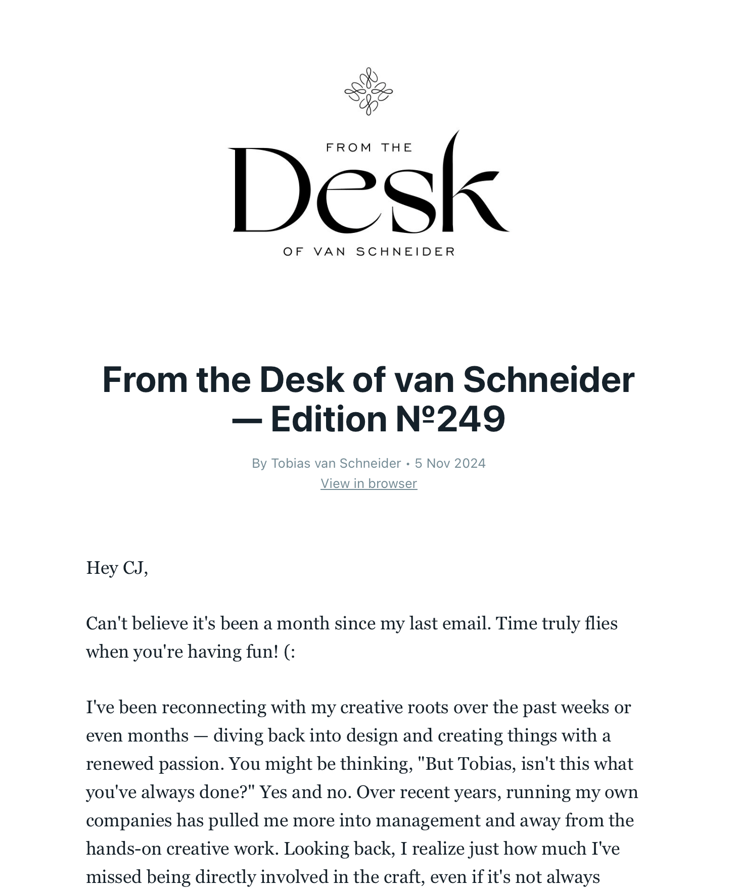
I hate the fake personalization of “Hey [insert name],” but I love that he resisted the urge to over-design the email as so many businesses do. When you see his portfolio, you’ll understand how much he’s holding back in his newsletter.
Dan Cederholm is another OG designer, who just launched a more-personalized, curated newsletter for his company, SimpleBits.
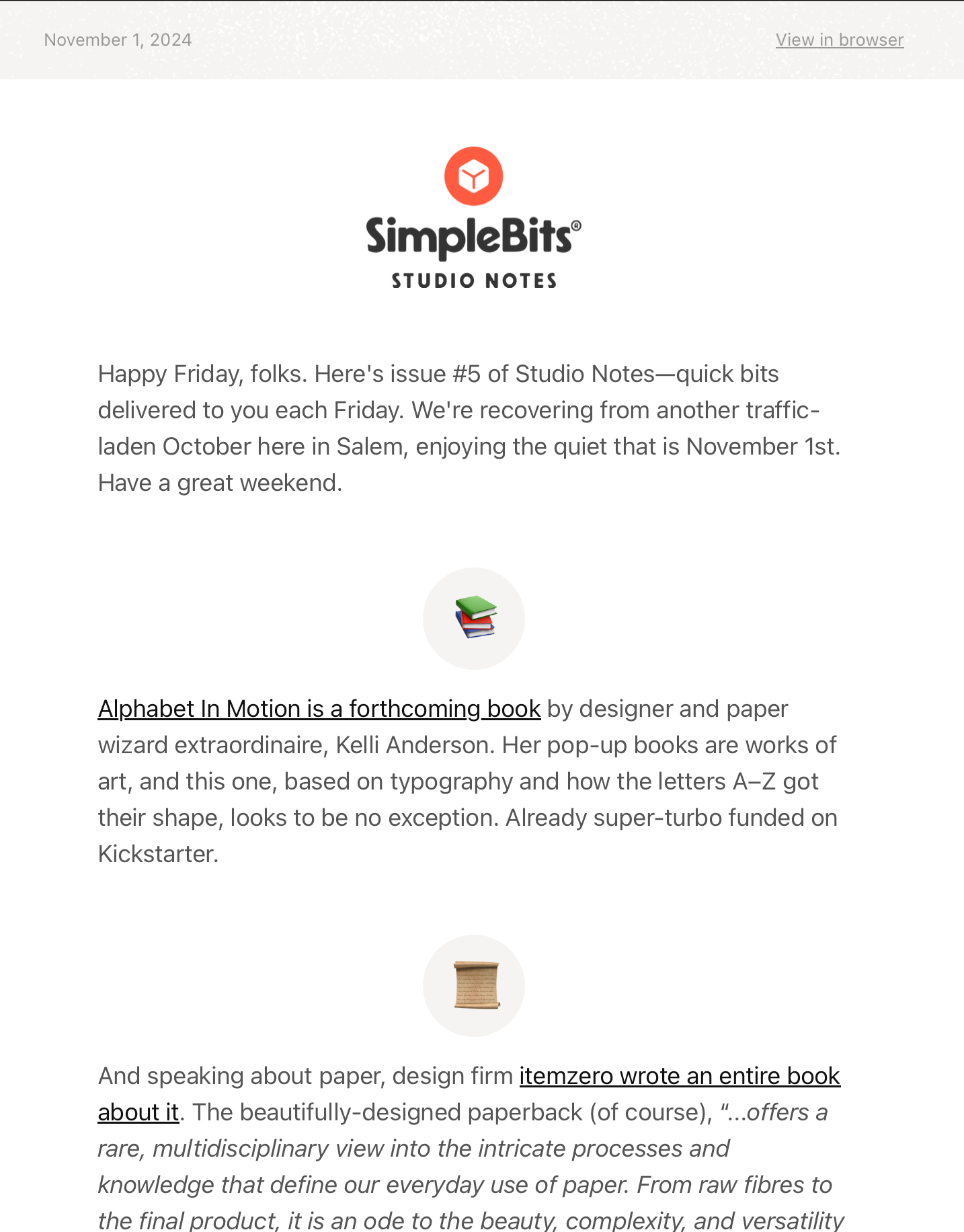
I’m a big fan, but I’d like to see less of the company and more of him. I’m not sure this newsletter needs a title or a masthead. He’s the star here.
That’s the story with all these approaches, though. Connecting one-on-one with your readers will always beat seeking shelter under the mast of a brand.