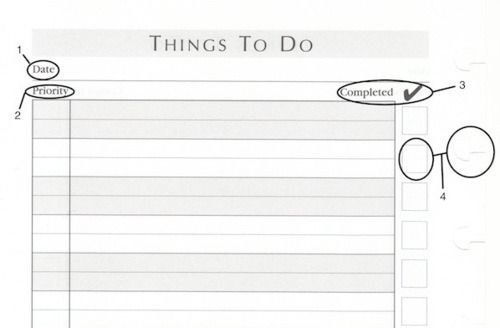
Levenger's Things To Do Sheets
In my Back to Paper post, I mentioned I wanted to redesign the Levenger Things To Do template for clarity. Maybe only I care about such things, but if you invest time and money into a company you care about, you should want them to help them constantly improve.

I’m considering making my own products to get these ideas out of my head, but until then, here’s how I’d redesign Levenger’s:
- The date field isn’t necessary and would be removed. What is this field supposed to record? The start date? The end date? If you can answer that, you still need to answer “of what?” It isn’t the tasks. There’s too many on a page for a date to correspond to all. It seems like it was tacked on. Save the date for index cards if needed.
- The priority field seems like a holdover from the Covey days (maybe a concession to the Day Runner crowd). By definition, a person can have only one priority at time. Covey was wrong about this area and the rest of the world caught on a few years ago (thanks mostly to GTD). The entire Priority column can be phased out. If you wish to rate your daily tasks in order of importance, save it for the index card (like the date). Order of importance can change by the hour and who wants to constantly append their lists? The truth is, no one bothers to even try after the first correction.
- The word Completed (with checkmark) seems unnecessary as well and would be removed. First, it seems added just to balance the other unnecessary fields. Second, it’s an unnecessary explanation (take a queue from Ikea and omit words when words are not needed). The checkmark itself is just a matter of preference. I prefer X’s, since they fit better with the size of the box. Some people have symbols to indicate when something is in process and when something is complete. So, the checkmark is, at best, a suggestion. That’s not enough of a reason to complicate an interface.
- The placement of the checkboxes is the biggest issue. I’m sure research was done to suggest placing the boxes to the right of the task description was optimal. I can’t imagine that research was done under practical circumstances. First, people read left to right. Scanning for completed items is aided by the boxes being on the left. Boxes on the right require the eye to scan the tasks as well as the boxes. This distracts the eye and make scanning much less efficient. Second, since the beginning of productive time, people have checked off their to-do list from the left. This is a useful convention that doesn’t need reinvention. Third, for right-handed people, the boxes end up being too close to the circa discs. Ever try to write that close to a circa disc? My X’s become two squiggly lines as my palm struggles to find a steady place to rest on the discs. The boxes need to be on left.
Any other suggestions? I didn’t even get into formats and materials. Let me know what you think and maybe we can design something even better.