I'm a HTMinimaList Nut
I’ve been struggling lately with redesign issues for one of my sites. I find myself coming back to my favorite kind of web design; a little-known school of web design popular for about a few months more than a decade ago: HTMinimaLism.
The idea is: instead of covering up the web with heavy-handed graphic design, and other concepts held over from the print era, embrace the simplicity, utility and beauty of the web’s most basic elements.
Some of today’s most popular web sites can trace their designs back to this school of thought. The advantages are speed, readability, search engine friendliness and future-proof flexibility.
Some examples of HTMinimaLism, past and present, for the uninitiated:
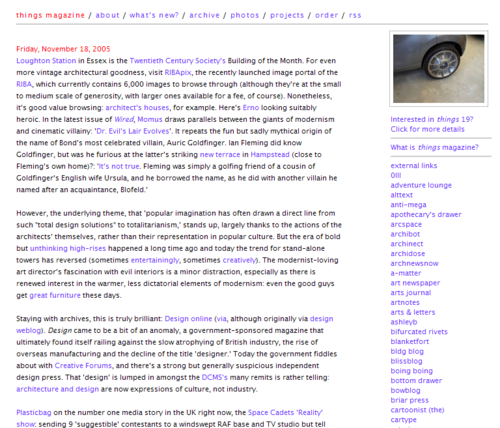
Things Magazine (circa 2005) (I love the simplicity and clarity of this navigation)
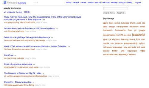
Pinboard (obsessed with speed and it pays off)
Craigslist (stubborn to this design for good reason)
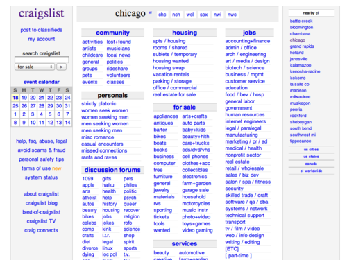
Craigslist (2006 suggested redesign):
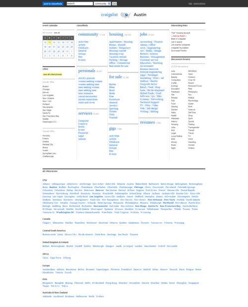
Drudge (arguably the most financially successful of the HTMinimaLists):

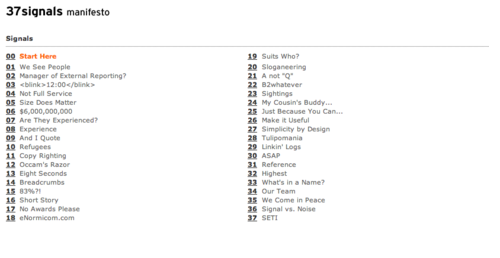
37 Signals Manifesto (circa 1999):
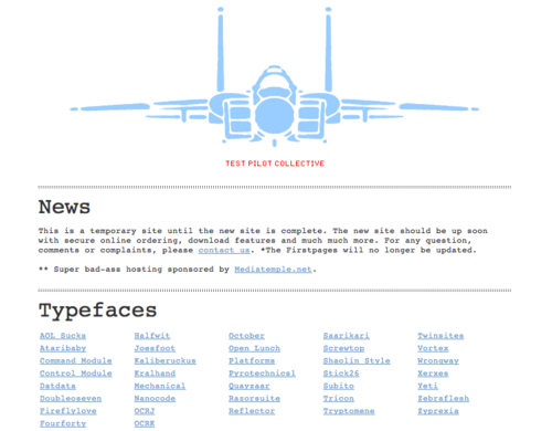
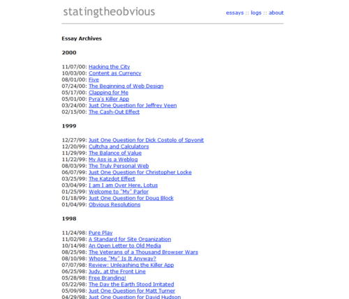
Stating the Obvious (circa 2000) (used an archive I still believe is the most usable I’ve ever seen):
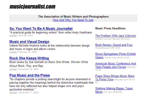
Musicjournalist.com (one of my own sites circa 2003):
