Home Screens as Therapy

I have nothing against technology. I do have a problem with using technology as a crutch to keep you from being creative. I have a big problem with my natural, sometimes destructive, tendency to consume a lot of information.
Batching time to consume helps, but sometimes it's more effective to put a real barrier between you and consumption.
The President and CEO of David Allen Company, Mike Williams, has a unique way of dealing with this. He designs his iPhone home screen to create a "micro pause" and ask himself, "Why am I here?"
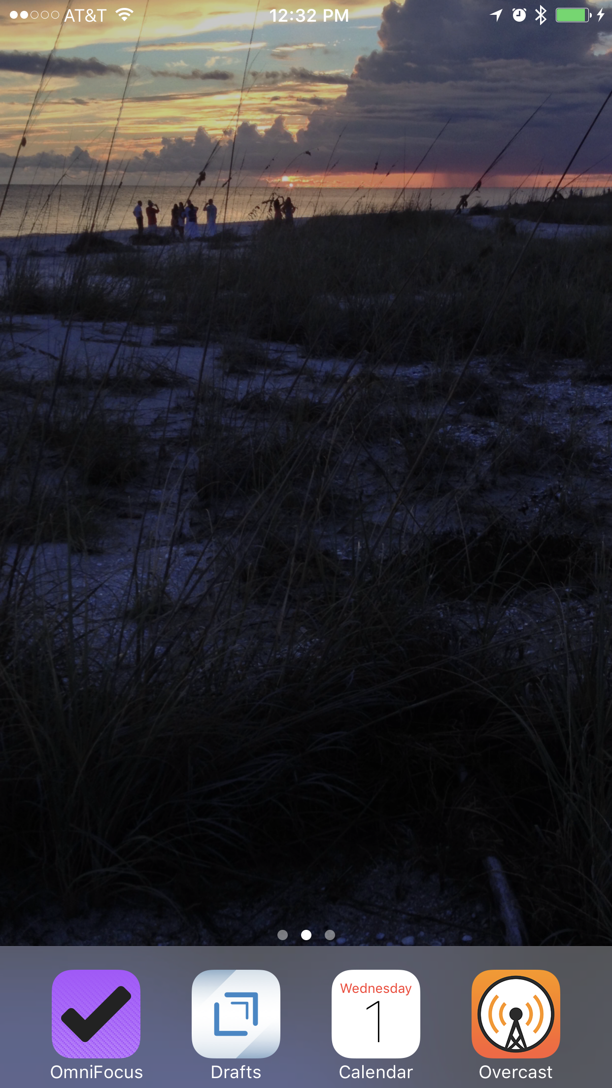
I first saw one of his screenshots two years ago on the MacSparky blog:

He explains his reasoning:
"My home screen is intentionally very simple. I do this to minimize distractions. The distractions are all tucked several screen swipes away. It is a simple reminder to me to keep things simple. The act of intentionally finding an app helps me become conscious to what I am doing and why. I also turn off 98% of all the alerts."
Apparently he has stuck with his philosophy, because he recently posted a new screenshot to Twitter:

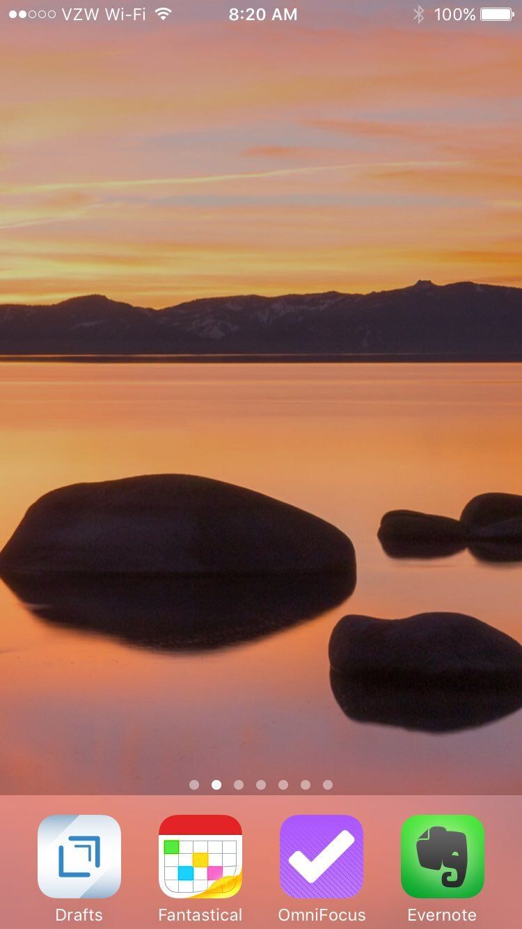
I love this idea. So, as a part of my focus this year on being more mindful with my time, I've done the same with my home screen. I've added a photo that personally means something relaxing and joyful as well (something we could all use a dose of several times a day):

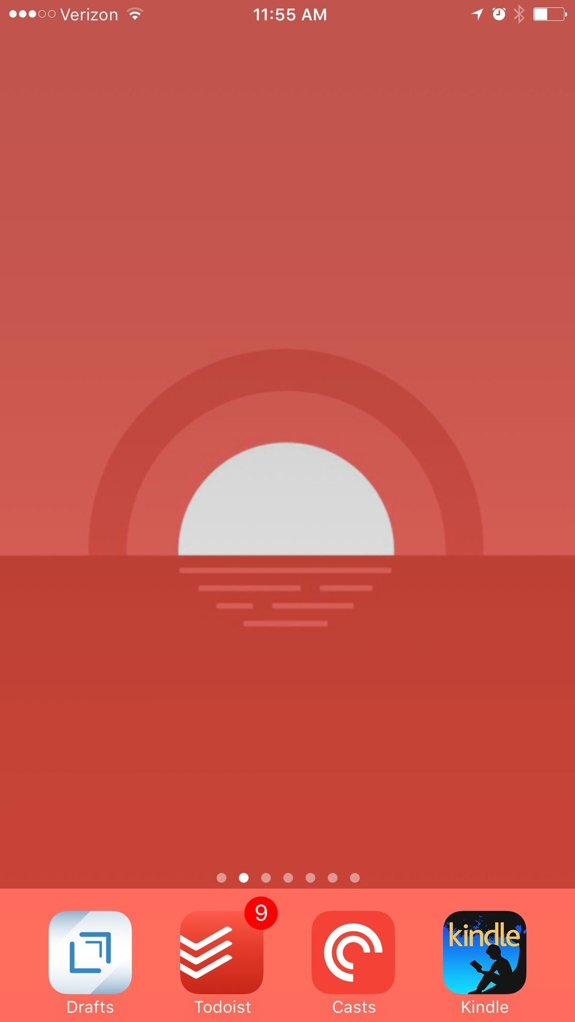
I'm not alone. Jay Miller sent me his, which is beautiful on another level:

This kind of thing represents the best of what the GTD community does these days (and Mike in particular). I may disagree on some of the details of implementation (like the treatment of the calendar), but the general ideas behind GTD and their ties to cognitive studies as well as mindfulness philosophy are always exciting to me.
I recommend this episode of the GTD podcast to get back on board with the most important aspects of the practice: GTD and the Organized Mind.
Update: Mike has posted a TEDx talk explaining his home screen philosophy.