A Lesser Photographer Gets a New Cover

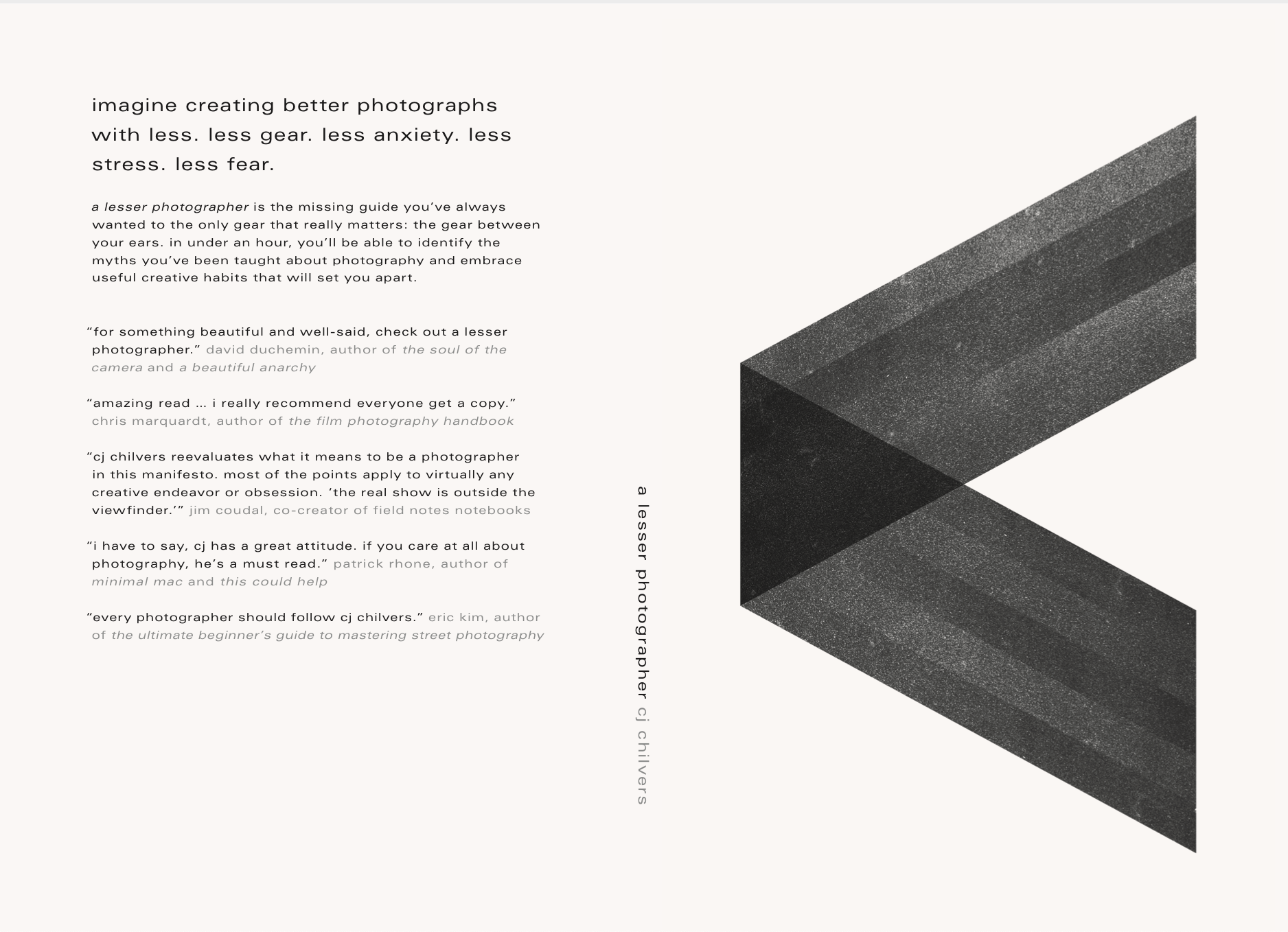
I loved the work Daniel Benneworth-Gray did on the A Lesser Photographer eBook cover, so I asked him to make a version of it for the print book, and now both versions have the same awesome cover design.

The new front cover of the print version.

The new print cover design with spine and back.
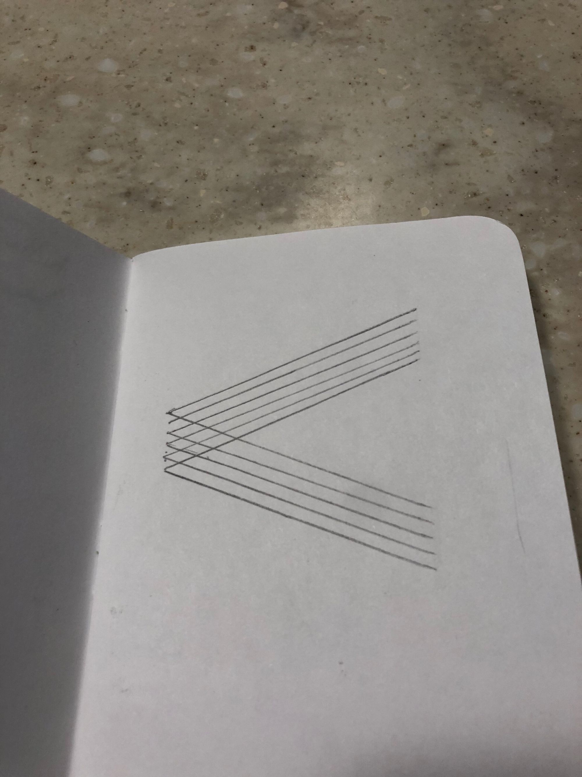
Daniel was the first to come up with the idea of incorporating a “lesser than” symbol, and I was “that guy” (who most other designers would hate) because I drew in a Field Notes notebook what I thought would look good and emailed it to him:

He took my terrible drawing and turned it into something really great. I highly recommend hiring him for your next cover.
Also, be sure to check out his newsletter, Meanwhile, for wonderfully obscure (my favorite thing in a newsletter) design and art links.